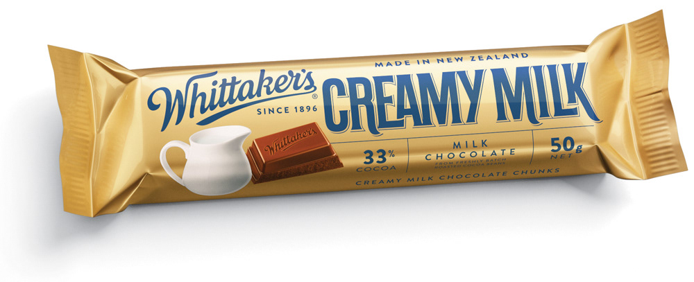
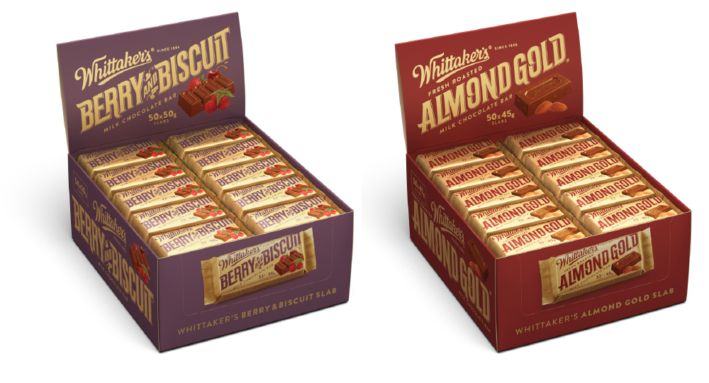
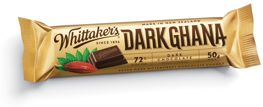
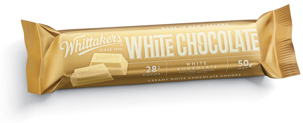
Whittaker's
Packaging Type & Lettering // J.H. Whittaker & Sons, New Zealand
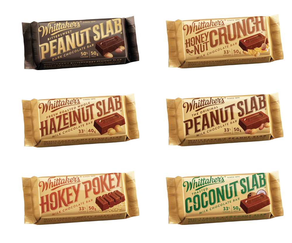
I love chocolate...but what I love even more is to design the packaging type for chocolate. New Zealand based J.H. Whittaker & Sons (Whittaker's) is a confectionery manufacturer specialising in chocolate since 1896. Whittaker's is the second-biggest chocolate brand in New Zealand. The company controls its entire manufacturing process, calling itself a "bean-to-bar" manufacturer, to ensure top-quality products. Well, nice that they also control how things are written on their products and decided to have a top quality packaging type.
Actually the packaging type is based on a font I designed at first glance. A base character set including numerous alternates and ligatures.
But before applying the final artwork to the desired packaging every product name got an optimised and individual touch up to ensure a unique top quality look.
But before applying the final artwork to the desired packaging every product name got an optimised and individual touch up to ensure a unique top quality look.
This project was realised in cooperation with Parkview Motorcamp NZ and URW++ Design & Development.